Dashboards -- Seeing the Health of Your Data
Learning Goals
By the end of this section, you will be able to:
- Understand what each dashboard in Osprey represents
- Navigate and interpret key health indicators
- Identify where to drill down when issues appear
- Connect dashboards to operational priorities such as reliability, compliance, and efficiency
Overview
Dashboards are your window into the health of your entire PI environment. Instead of waiting for someone to report that a display is broken or that a tag looks off, Osprey automatically surfaces these issues for you. In just a few seconds, you can see which areas are healthy, which are at risk, and where to focus first.
Dashboards help you move from uncertainty to awareness. They give you real-time visibility into how your data systems are performing and where attention is needed most.
The Role of Dashboards
Think of Osprey dashboards as your daily control panel. Each widget represents a slice of your PI ecosystem -- assets, calculations, displays, or interfaces -- and summarizes its health at a glance.
The purpose of dashboards isn't just visualization; it's prioritization. They answer one critical question: Where should I look first?
Dashboards guide you from high-level awareness to actionable investigation. Instead of reacting to issues as they surface, you can proactively monitor the system and lead with clarity and confidence.
Core Dashboards
Let's look at the core dashboards you'll use most often in Osprey. Each one is designed to serve a specific role in maintaining data quality, visibility, and trust across your PI System.
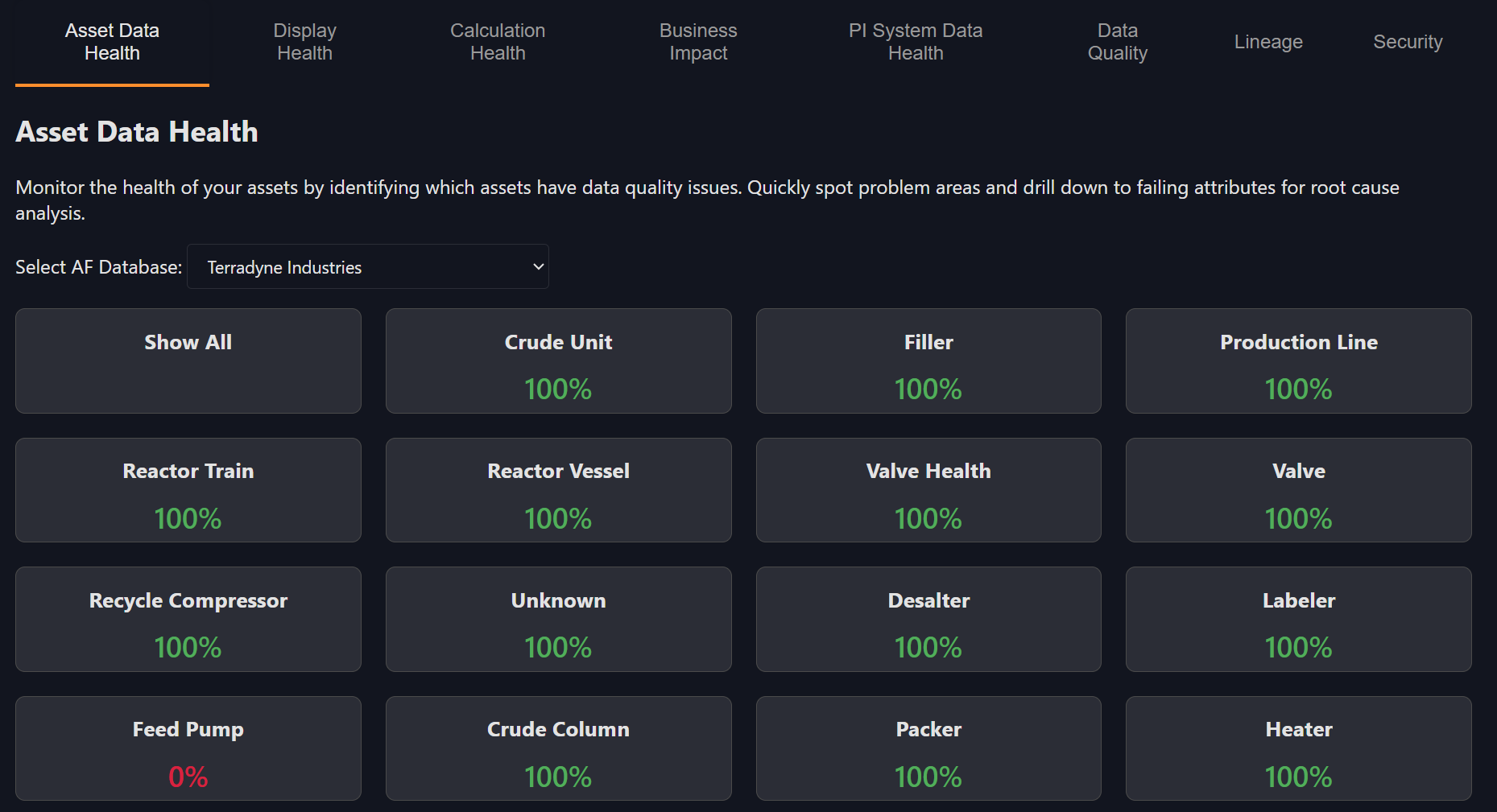
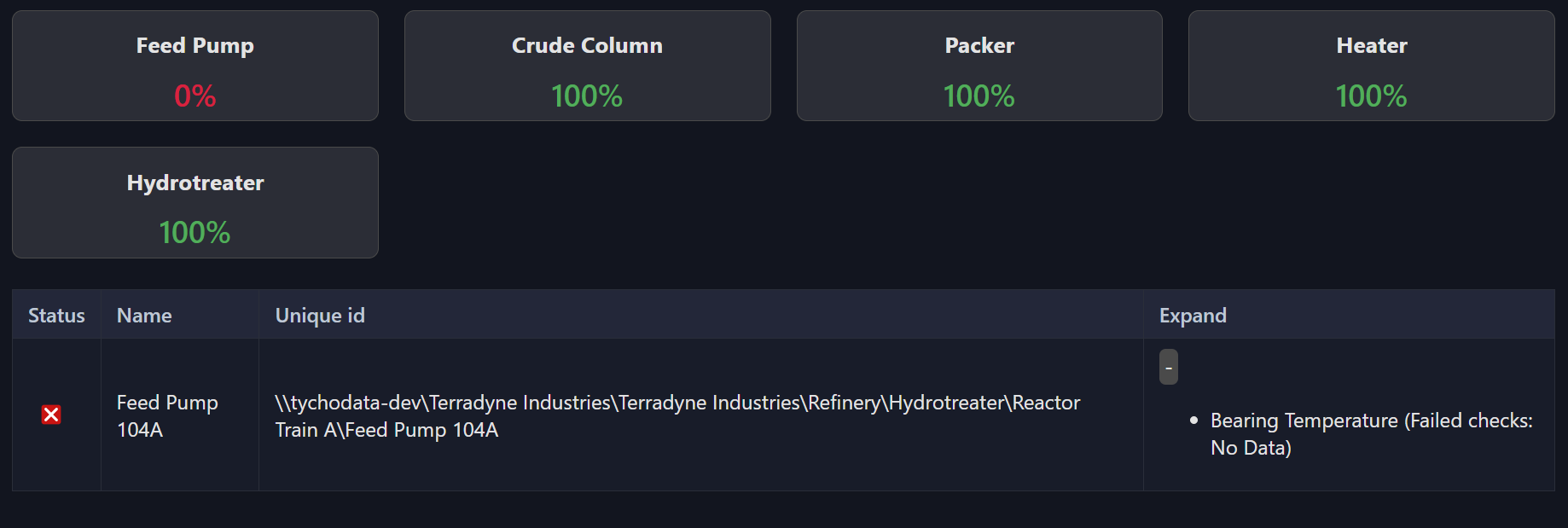
1. Asset Data Health
The Asset Data Health dashboard summarizes data quality across AF databases and templates. Red indicators show stale or bad data, while green indicates healthy signals. Use this dashboard to assess overall signal integrity and quickly pinpoint areas that need attention.
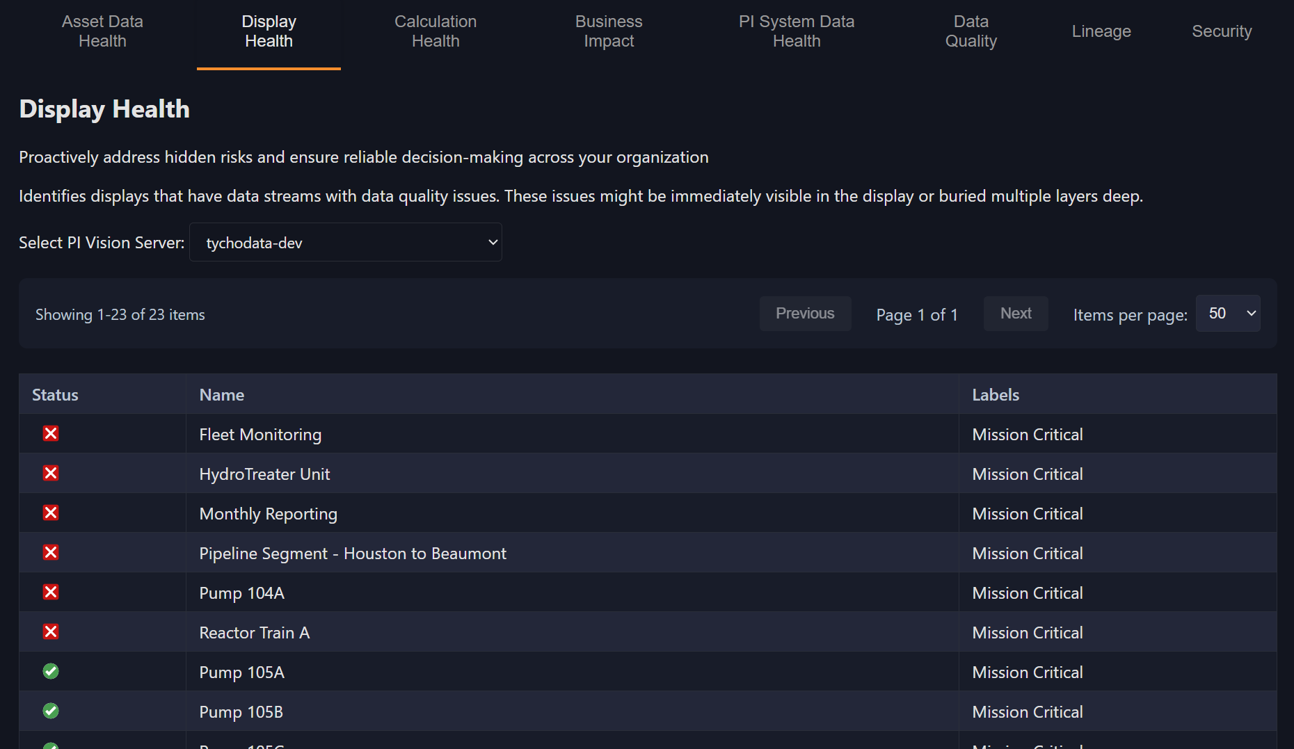
2. Display Health
The Display Health dashboard evaluates the condition of PI Vision displays. It identifies displays that reference bad data or fail to load fully. This view is essential for PI Vision administrators and engineers who maintain operator dashboards and need to ensure reliable visualizations.
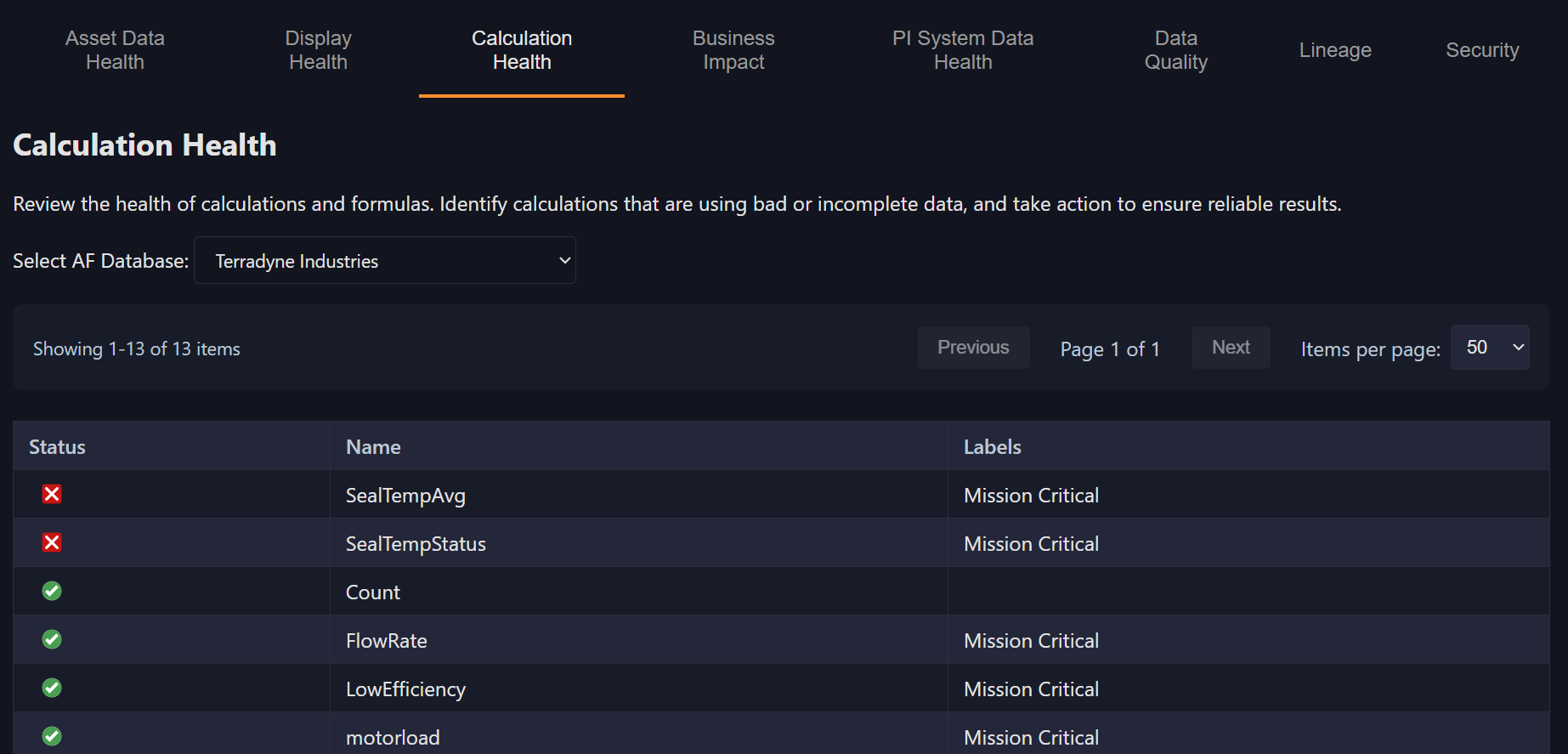
3. Calculation Health
Calculation Health tracks AF Analyses for failures, bad references, or outdated dependencies. A single failed calculation can propagate incorrect values downstream, and this dashboard helps you catch and resolve those problems before they spread.
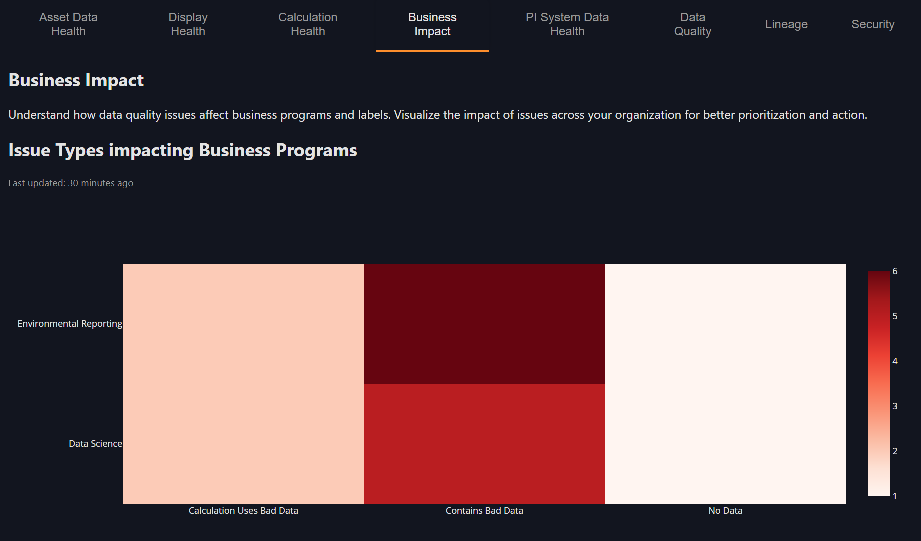
4. Business Impact
The Business Impact dashboard rolls up data quality by label or use case -- for example, Mission-Critical, Environmental, or Reporting. This view helps leadership connect data quality to real business outcomes by showing how issues affect operations, compliance, and key initiatives rather than just individual tags.
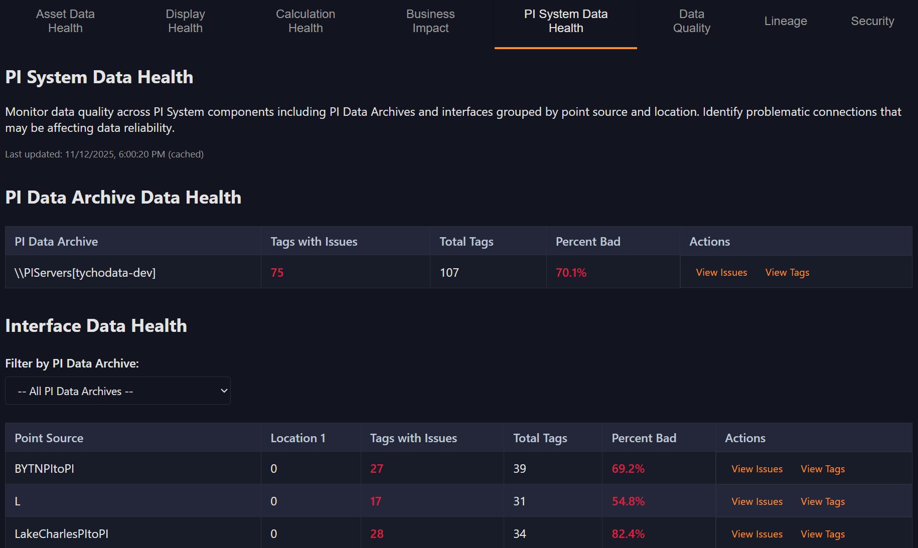
5. PI System Data Health
The PI System Data Health dashboard monitors overall data archive and interface collection quality. It helps you determine whether issues are system-wide -- such as a stalled interface -- or localized to a specific tag or data stream.
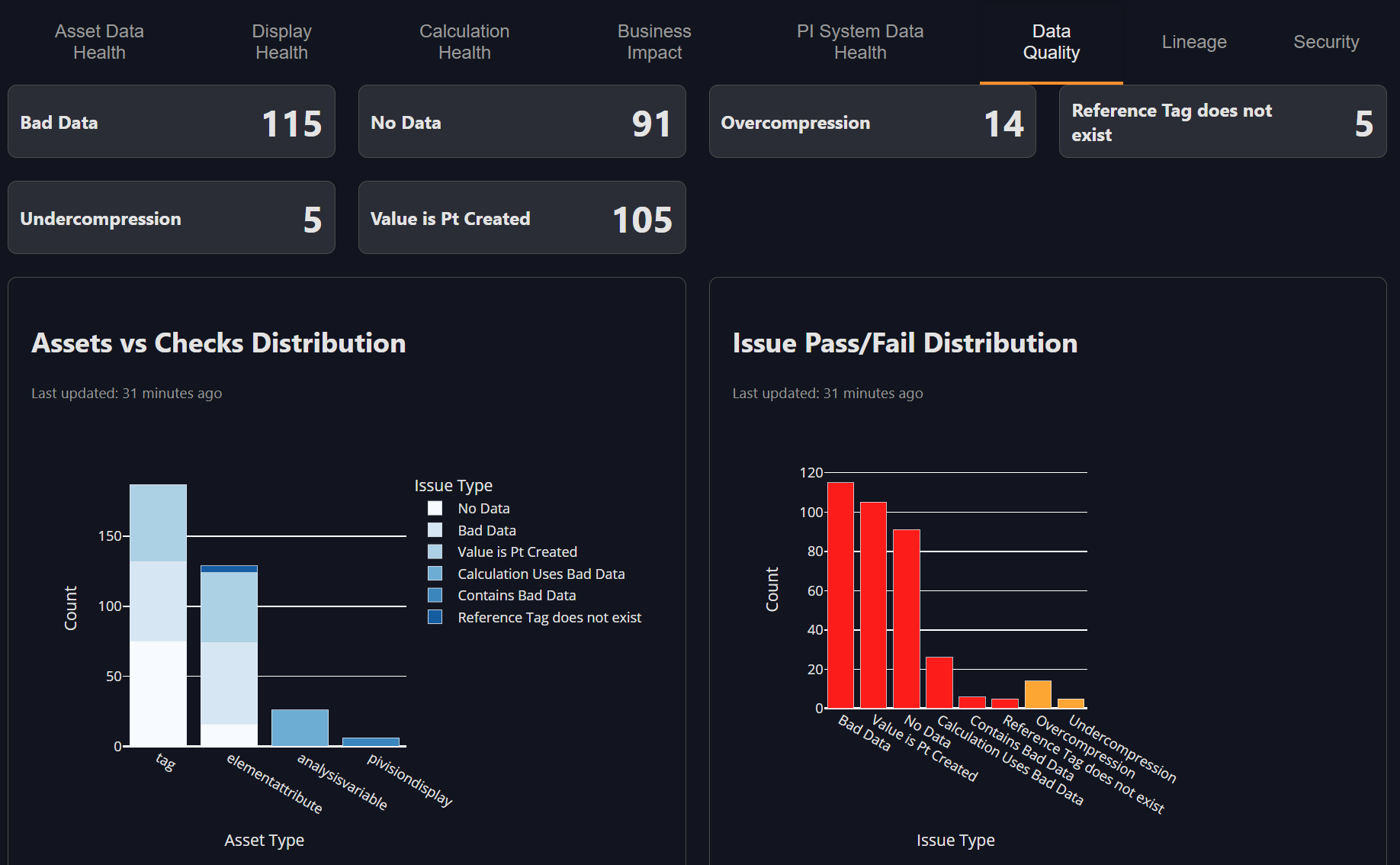
6. Data Quality
The Data Quality dashboard provides a detailed breakdown of issue types across your PI System. You can see counts for no-data gaps, over-compression, stale values, and other conditions that impact signal integrity. This dashboard helps you understand not just where problems exist, but what kind they are.
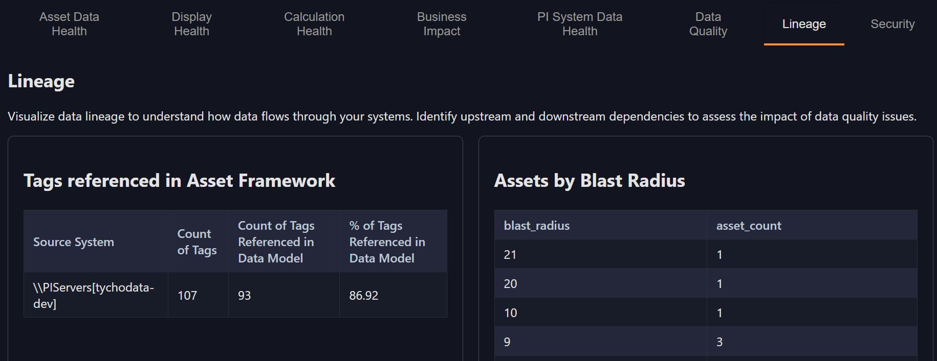
7. Lineage
Lineage visualizes how data objects depend on one another. It allows you to trace issues upstream to their sources and identify downstream systems or displays that might be affected by a single change. This dashboard is key for diagnosing cascading issues across interconnected systems.
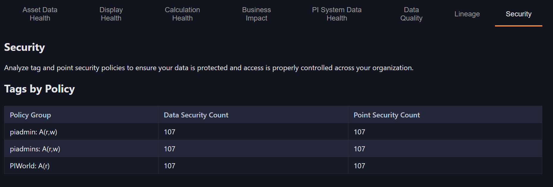
8. Security Views
Security Views highlight permission structures and potential gaps in access policies. These dashboards are particularly useful for administrators who need to verify governance boundaries and ensure that users have appropriate, compliant access to data.
Key Takeaways
Osprey dashboards bring clarity and structure to your PI environment. They show what's healthy, what's failing, and what needs attention -- all in one place.
By integrating dashboards into your daily workflow, you can monitor system health continuously, identify issues before they become costly, and align your data quality practices with broader operational goals such as reliability, compliance, and efficiency.
Your Turn
Now it's time to explore Osprey dashboards yourself. Follow these steps to get hands-on experience:
- Log in to Osprey using your credentials
- Navigate to Dashboards by clicking on "Dashboard" in the left-hand navigation menu
- Explore each dashboard to familiarize yourself with the different views and widgets available
- Drill down into Asset Data Health:
- Click on issues related to Feed Pump
- Click on the Feed Pump 104A asset to see all its attributes and understand the full context of any data quality issues
Knowledge Check
Question 1
What is the main purpose of Osprey dashboards?
A. To adjust PI tag configurations directly
B. To visualize and prioritize the health of data and systems
C. To modify AF templates
D. To manage user accounts
Question 2
Are there any data quality issues in Terradyne Midstream? What types of issues are there?
Question 3
What PItoPI interfaces are set up?
Question 4
Are there any displays with data quality issues?
Question 5
What does the PI System Data Health dashboard track?
A. Interface collection health
B. PI Vision display counts
C. Tag descriptions
D. AF templates